

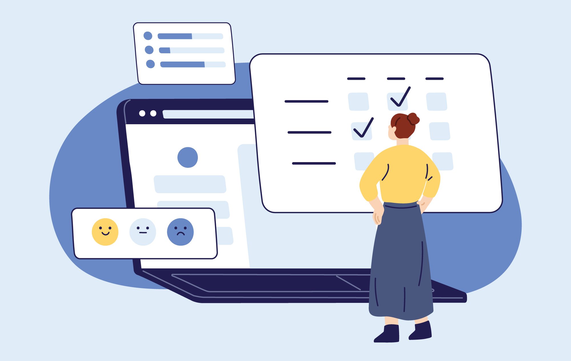
Technically speaking, user error is any mistake caused by a person using a device or website, and not the technology itself. When these mistakes happen, it’s easy to place blame on the user, but it’s really the responsibility of the designer or developer to reduce the likelihood of user error.
Using accessible practices in web design is a great start in preventing user error. High-contrast color combinations, for example, will help make interactive elements more apparent and understandable. The use of hidden text for assistive technology, clear visual cues, and well-structured code will also help ensure users can interact with your website exactly as you planned.
However, a website can be fully accessible from a technical standpoint but still prone to user error overall. Users make two types of errors—slips and mistakes—and by understanding the differences in each, we can identify and implement solutions using user experience design.
Slips
Slips are unconscious errors, such as a typo in a search input or clicking the wrong button. In essence, the user understands how an interface works, but makes an error anyway, often because they are not giving their full attention to the task.
So how do we prevent these types of user errors?
1. Limit choice thoughtfully
Hick’s Law states, “The time it takes to make a decision increases with the number and complexity of choices.” For all users, but especially users who are distracted, this is pretty important to consider: if completing an action is complicated or time-consuming, they’re more likely to make a slip⸺or not do it at all.
You’ll want to reduce distractions by allowing users to focus on one task at a time, completed consecutively, instead of many tasks completed simultaneously. And along the way, you can provide context, reminding the user where they’ve come from and where they’re going through a variety of signals and cues.
- Are goals clear and easy to find?
- Are the most important elements on this page also the most prominent?
- Is information arranged in a logical order? (i.e. alphabetically, chronologically)
- Do forms only ask for necessary information?
- Is the use of language easy for my audience to understand?
- Can any part of this experience be simplified?
2. Be forgiving with user inputs
Design with a forgiving format in mind. The average user makes eight typos per 100 words on desktop and a whopping 42 typos per 100 words on mobile. Imagine you manage a travel website, and someone tries to search for trips to “Philladelphia” instead of “Philadelphia.” Will your technology understand a typo was made and show the correct results? Or, will it force your user to re-type the information correctly? For any user, this would be a frustrating experience, but it could be particularly challenging for a user with a disability.
Your website should be flexible enough to allow the user to interact in a way that’s natural for them—such as allowing them to enter their phone number on a form with whatever formatting they want. As they begin typing, the form can reformat the phone number with spaces, parenthesis, and hyphens. If they accidentally type a letter, the form will disregard it.
You should provide forgiving fallbacks in the event of a slip. For example, an autosave feature on a long application form is helpful in the event that a user accidentally closes their browser midway.
3. Predict user input or offer suggestions
Don’t make your users remember information or have to re-enter information over and over. Whenever possible, you want to save them the work, but also limit the chance of a slip. Back to our travel website example: we might consider...
- Do forms pre-populate and/or auto-complete with known values from previous interactions? (i.e., saved billing information)
- Do form elements have common default states? (i.e., “1 room, 2 adults, 0 children”)
- Is there an easy way for the user to undo or redo an action?
- Do interactive elements include accessible help text to guide the user?
- Are there easily accessible troubleshooting resources, if needed?
 4. Use constraints to guide your user
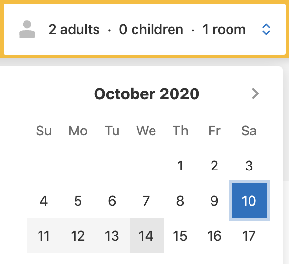
A constraint is anything that prevents a user from taking a particular action. These limitations can be useful in safeguarding against slips. If a user is trying to book a hotel with a check-in of October 10, a constraint would be not allowing them to select a check-out date before then.
If the user attempts to select a date before October 10, it helpfully resets the check-in value to that date. (Useful if the user accidentally clicked the wrong date in the first place!)
Mistakes
When users interact with technology, they start to develop what’s called a mental model—a belief of how a thing works. From there, they develop predictions that inform their future actions (“If I click this button, the form will be submitted.”)
Mistakes happen because a user has a misunderstanding in their mental model, or incomplete information about how an interface works. To prevent mistakes, we need to ensure our user’s mental model lines up with our interface.
 5. Use conventional and consistent patterns
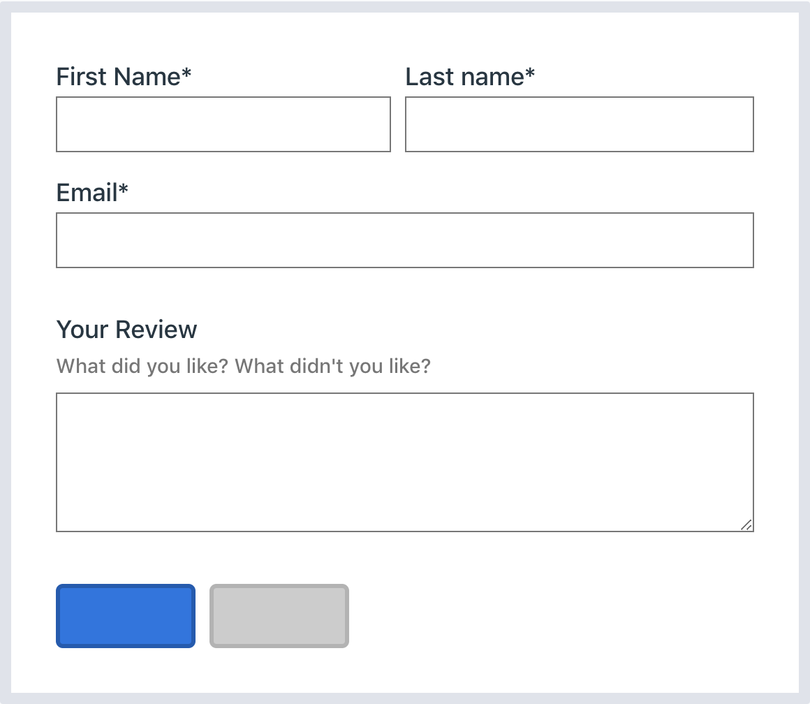
Your users will spend a lot more time with other websites and tools than yours, which means they’ll come to your interface with certain expectations, underscoring why your user experience needs to use simple, familiar patterns. For example, if we look at the form below, even without any language, you’ll predict that the colorful button on the left will submit the form, and the grey button on the right will reset or cancel it. This is because we’ve been trained to expect this through interaction with other forms on other websites.
As designers and developers, we shouldn’t reinvent the wheel. We should rely on these conventions to ensure a positive user experience.
As Don Norman explains in The Design of Everyday Things: “Experience is critical, for it determines how fondly people remember their interactions.”
Some things to consider:
- Are goals simple, clear, and easy to find?
- Do interactive elements have strong, predictable signifiers of what will happen? (i.e., all text links are the same color, so it’s clear to the user which elements are clickable)
- Do interactive elements give feedback to the user? (Example: a sign-up form asks the user to create a password. The input has a highlighted border when clicked, and a colorful green border with a checkmark icon to validate the password is acceptable.)
- Does your navigation and organizational hierarchy of content stay consistent from page to page, so the user does not feel lost or confused?
 6. Warn before mistakes can be made
Twitter has a strict character limit of 280 characters. As the user types, a character counter shows the remaining characters, warning that the limit is approaching. Once the user surpasses the limit, the “Tweet” button greys out to indicate it’s no longer clickable until the user deletes the highlighted text.
This makes for a more enjoyable user experience because they are presented with subtle warnings that prevent an action, as opposed to an error alert afterward.
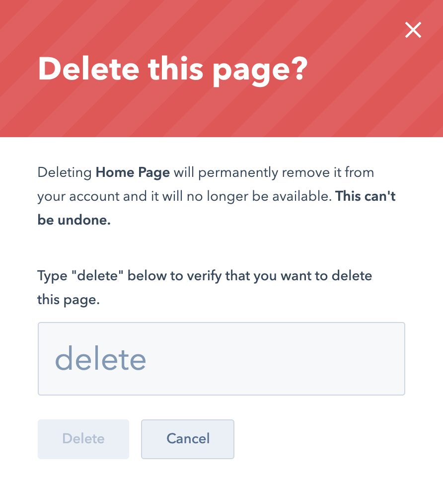
7. Encourage users to double-check their work
Give your users an opportunity to edit their work or undo a particular action. HubSpot, for example, requires users to double-check that they really want to delete a webpage before it is removed. Click “delete” and the user will be asked to type the word “delete” into a popup to confirm, or easily cancel the action altogether.
Other great examples of this are:
- A final order summary that can be reviewed and modified before a user places their order
- Asking a user to re-type a password to check for accuracy
- Adding a “reset” button to forms
- A checklist or alert that explains what to expect after an action
Summary
Users will always make errors when interacting with technology, sometimes in surprising ways. But we can prevent slips and mistakes by considering the user experience carefully, simplifying where possible, and relying on accessible conventions. When errors occur, we can make that experience less frustrating for our users as well by helping them correct the issue easily and quickly.


Leave a Comment